03 ACCESSNY
2024
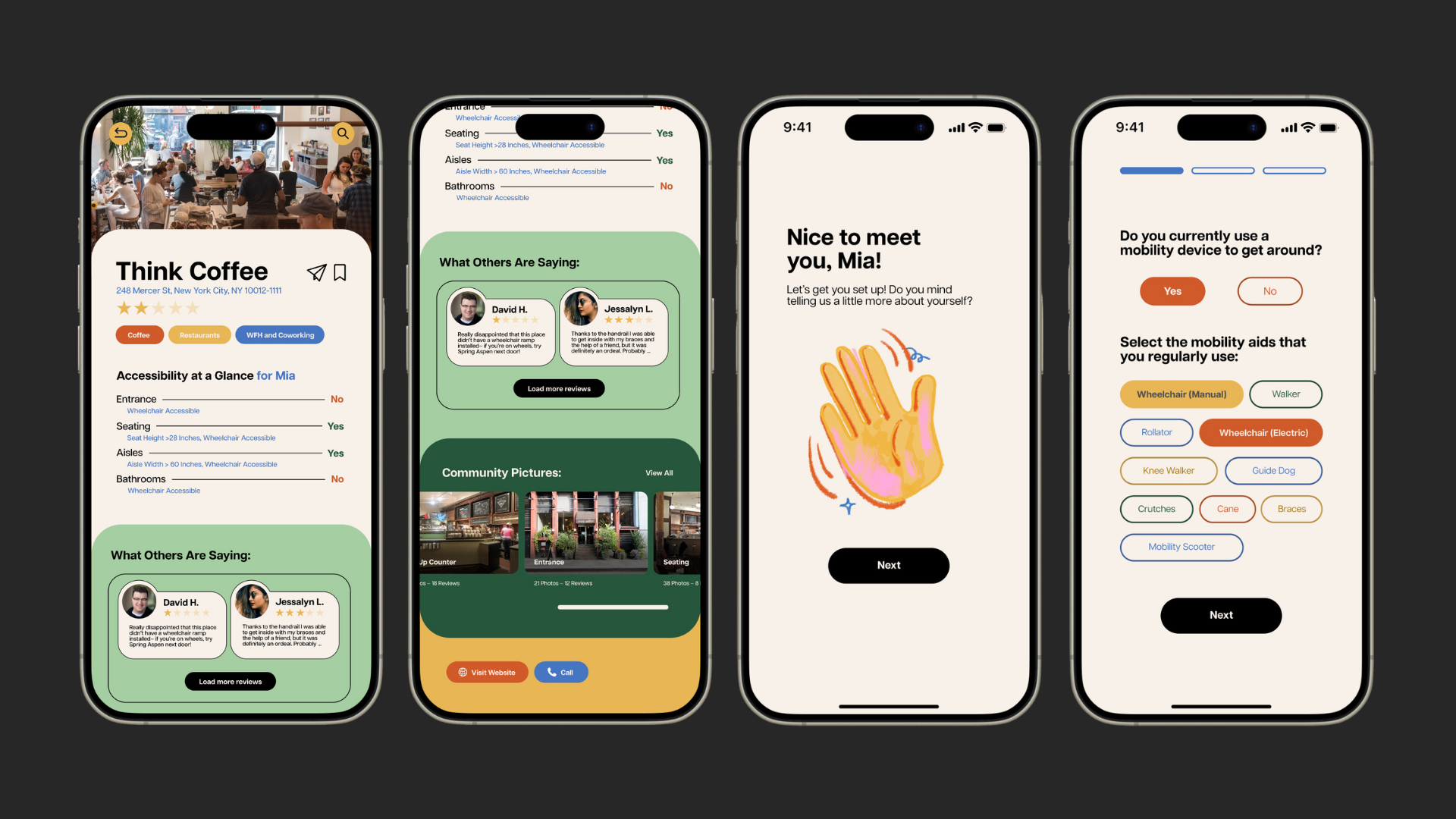
AccessNY
PROJECT OVERVIEW:
For my UX Design class, I was tasked with ideating, researching, and designing a digital experience that adressed an issue of my choice. I decided to imagine a mobile app that would facilitate access and ease for mobility-impaired individuals around New York City.
For my UX Design class, I was tasked with ideating, researching, and designing a digital experience that adressed an issue of my choice. I decided to imagine a mobile app that would facilitate access and ease for mobility-impaired individuals around New York City.
TIMELINE:
April–May 2024
5 Weeks
ROLE:
Product Designer
April–May 2024
5 Weeks
ROLE:
Product Designer
TOOLS:
Figma
Adobe Illustrator
Procreate
Figma
Adobe Illustrator
Procreate
Empathizing with Users
For mobility-impaired individuals, it’s a constant challenge to get around New York City due to outdated infrastructure, a lack of cost-effective alternatives, and a shortage of easily accessible, accurate, and timely information regarding the accessibility of different locations. Today, their best option is to extensively research and memorize accessible storefronts and points of interest before going about their days in order to make sure they can be accommodated, but this is time-consuming, unreliable, and impractical. This is especially true for mobility-impaired travelers or people who are not familiar with New York City.
This problem statement led me to my guiding design questions:
How might we improve the experience of traveling around and living in New York City for mobility-impaired individuals?
How might we reduce the time and effort needed to make plans in New York City for mobility-impaired individuals?
How might we streamline accessibility information in New York City to empower mobility-impaired individuals to navigate the city more efficiently?
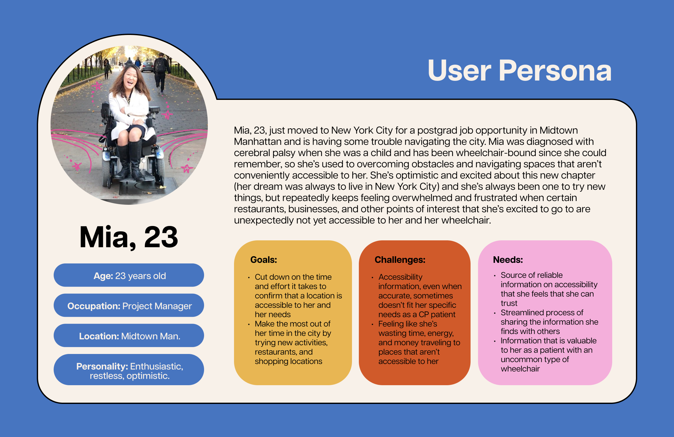
Research and Analysis
Before coming up with any solutions, I decided to conduct some more research into the problem at hand, with the goal of gaining a deeper understanding of the accessibility challenges faced by mobility-impaired individuals in New York City. In my research phase, I employed qualitative research methodologies that focused on user-generated content analysis. This approach allowed me to gather rich, detailed insights directly from the voices of those who experience these challenges firsthand.
I conducted a thorough analysis of testimonials and personal accounts from mobility-impaired individuals. These narratives, gathered from various interviews and articles as well as online platforms such as Reddit, forums, and social media, provided invaluable firsthand insights into the daily obstacles and frustrations encountered by users. This method proved to be particularly effective in identifying common pain points, needs, and desires expressed by the community.
- Current strategies for navigating wheelchair accessibility:
- Looking in windows for wheelchair accessibility signage
- Calling locations in advance
- Learning and retaining certain facts and rules: i.e. All MTA buses are accessible, but most subway stations are not yet accessible. Some NYC yellow taxis are wheelchair accessible but some aren’t, and you need to use Accessible Dispatch to guarantee that your ride will fit your accessibility needs. All Broadway theaters are accessible.
- Types of mobility aids:
- Wheelchair (Manual), Wheelchair (Electric), Walker, Knee Walker, Rollator, Cane, Crutches, Braces, Mobility Scooter, Guide Dog
- The case for more detailed user-generated information
- Different types of wheelchairs– motorized wheelchairs for cerebral palsy, for example– are designed for different kinds of mobility conditions and sometimes require more space or other accommodations compared to a regular wheelchair
- Ex. many cerebral palsy wheelchairs include a power tilt feature that rotates the chair 30-60 degrees upward in order to relieve pressure from specific parts of the body that require more space, and additionally, they sit slightly higher than regular wheelchairs, making it harder to fit under certain tables even when they are deemed accessible to other wheelchairs and mobility aid.’
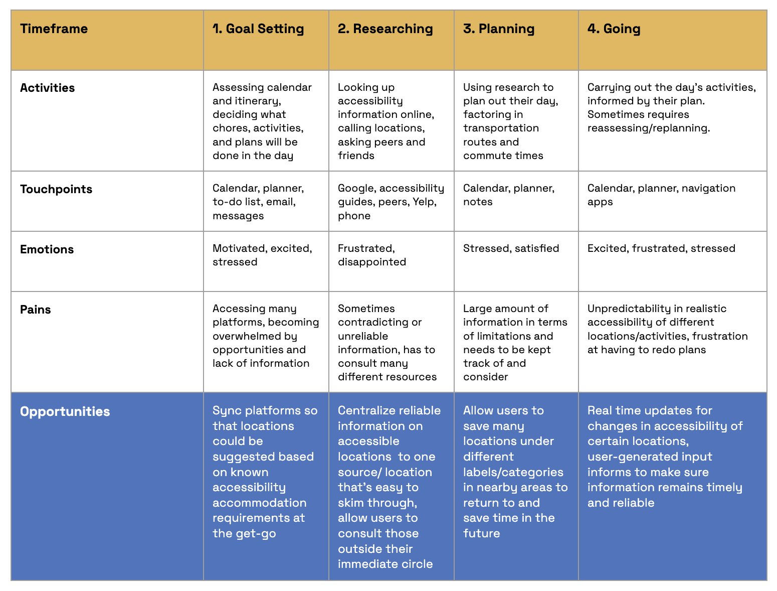
Using these findings, I decided to make a current state journey map to help identify potential areas for improvement by highlighting emotions and pain points:
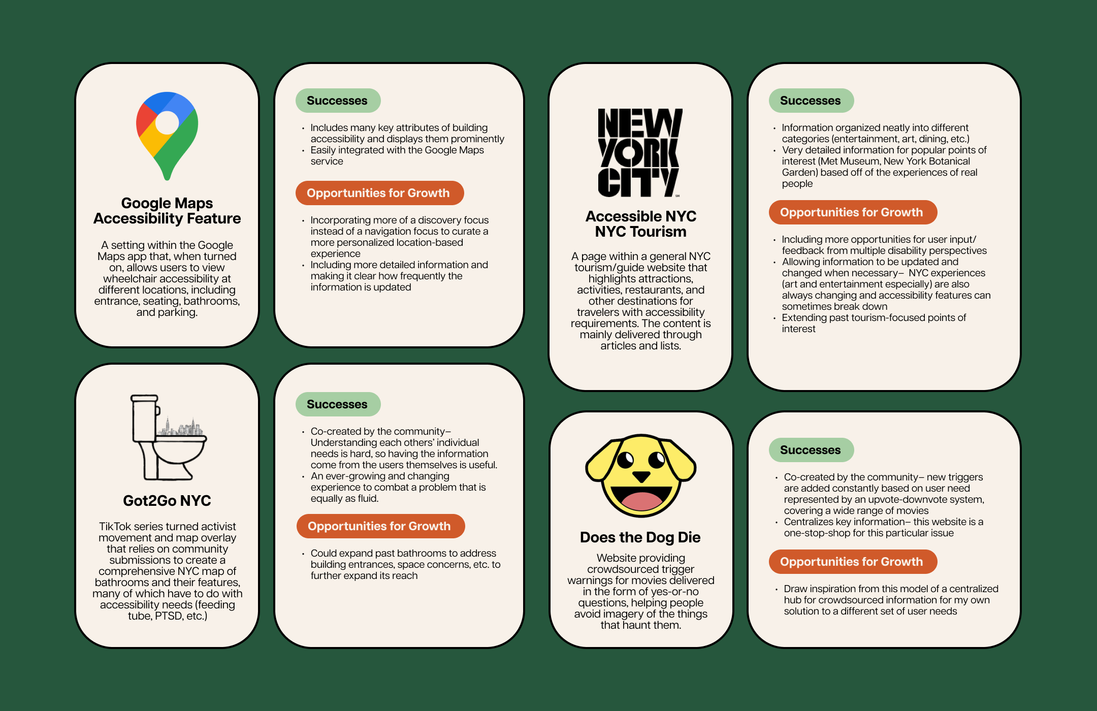
Part of my research process also included conducting a competitive analysis of other products and services that either 1. aimed to address similar issues, or 2. aimed to address slightly different issues using strategies that I identified as potential opportunities for improvement, such as the centralization of information or the implementation of user-generated content. My findings are summarized here.
Design Approach / Feature List:
Drawing upon my user research, competitive analysis, and identified areas of opportunity, I came up with a framework for my product and a supplementary list of features that would define the user experience on the app.
- Search bar for either discovering new locations or searching for a specific location along with a “search by map” option
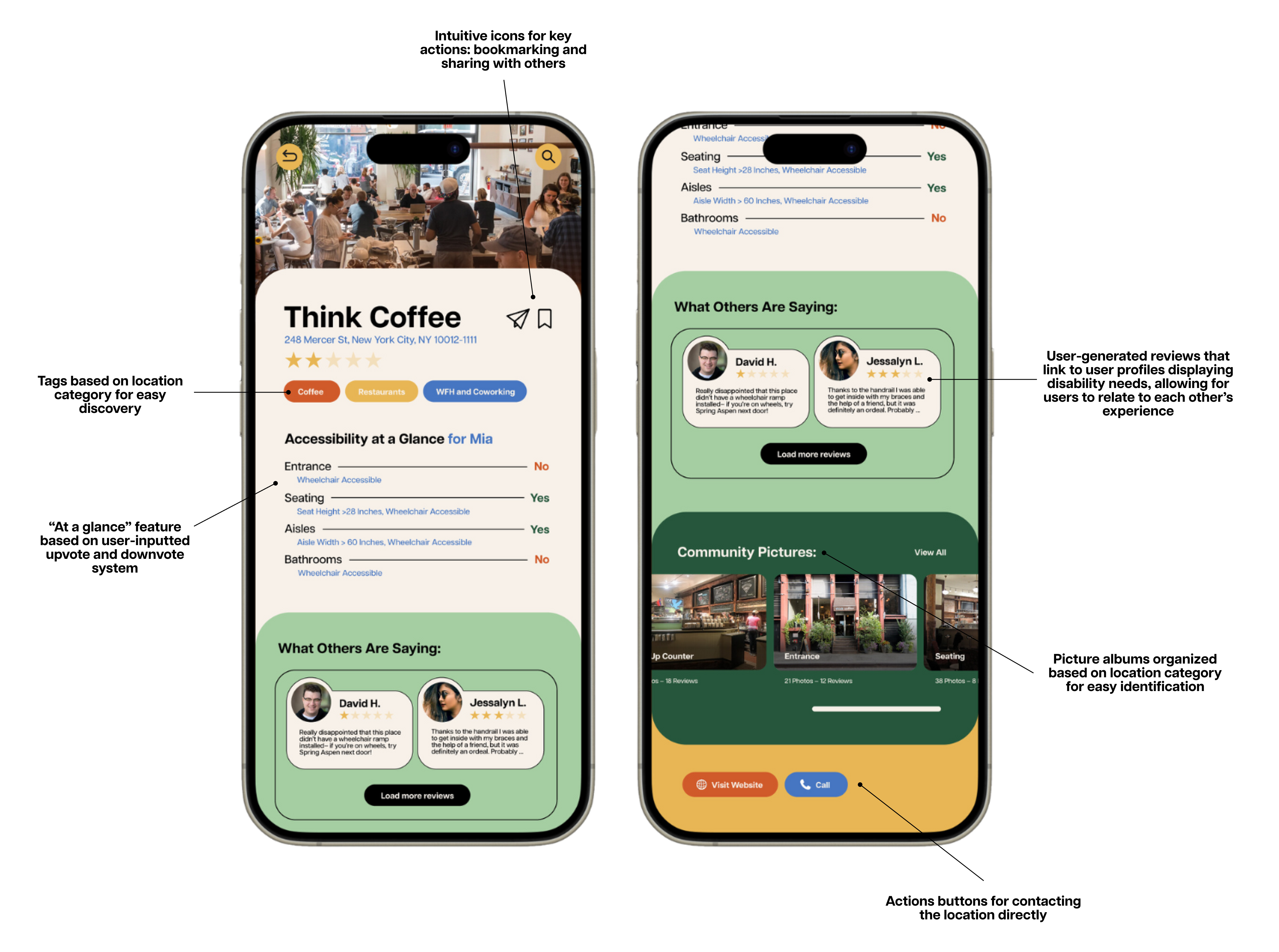
- “At a glance” Yes/No accessibility checklist using an upvote/downvote system that could still reflect time-sensitive changes/closures
- Option to add new checklist items at any point
- Categories to browse from on a “discover” page: restaurants, barbers, museums, parks, and timely “collections”: spring activities, holiday activities, etc
- Reviewer’s profile can feature info about their particular accessibility needs (if they’re comfortable) to better allow readers to assess how their own needs compare with the experiences of a reviewer’s
- Option to upload pictures and videos
-
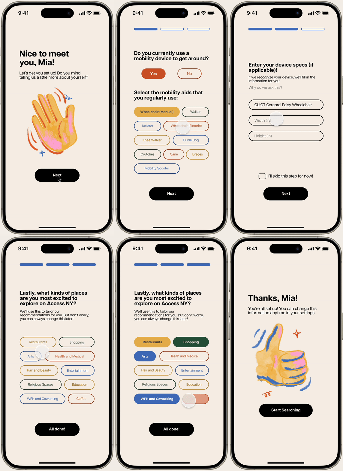
Option to save preferences on certain cuisines, and types of establishments to aid in discovery and filtering search options
- “Share” option to send a review to a contact or social media
CONTENT APPROACH:
- Playful yet simple and clean identity and tone
- User-centric copy and tone-of-voice
- Your recommendations are generated based on your accessibility needs profile
- Flows and navigation are intuitive due to impactful labels and copy
- Feedback mechanism: Users can call a representative if they run into a problem with the app
METRICS FOR SUCCESS:
- Adoption and retention analytics– how fast are people joining and how many times do they realistically use the app per day?
- Task success rate for location audits and saving an accessible location
- Number of reviews and how often people write reviews
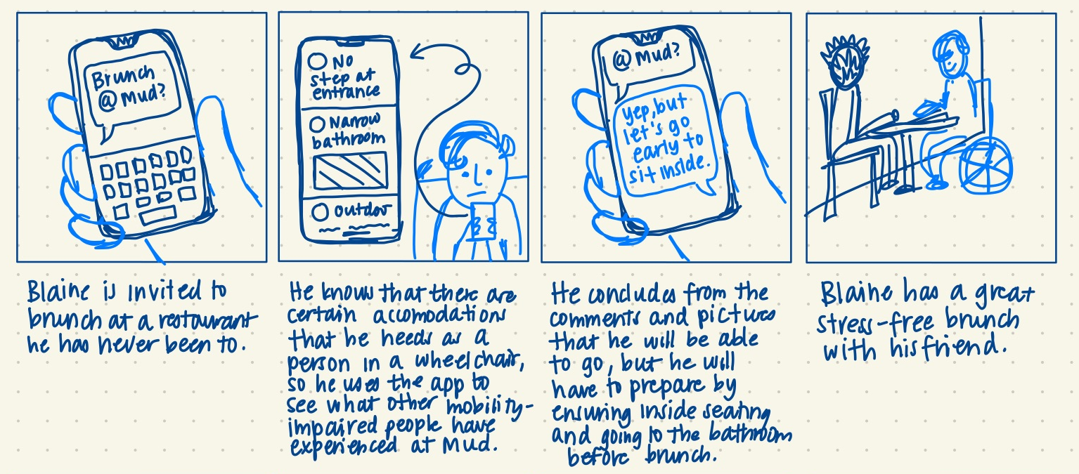
STORYBOARDING– FUTURE STATE JOURNEY MAP:
USER FLOW DIAGRAM:

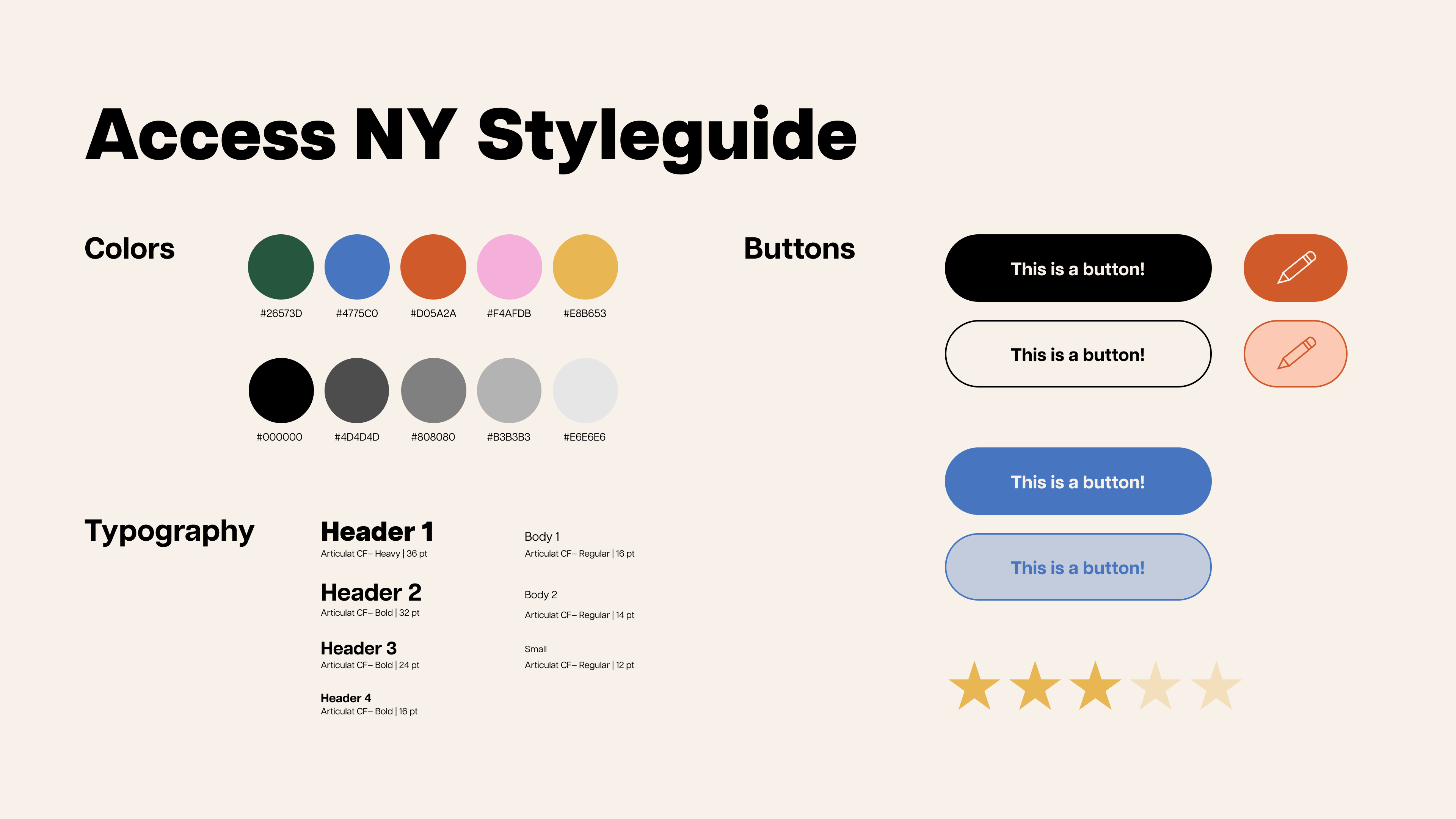
Styleguide / Look of the Product:

Final Screens
ONBOARDING FLOW:

REVIEW PAGE:
What’s Next
- Design a social media and advertisement campaign as a call to action to submit accessibility information for different locations.
- Because the app centralizes crowdfunded and user-inputed information, having enough storefronts and points of interest accounted for would be extremely important in order to onboard and retain users.
- Additional campaign encouraging businesses themselves to self-report available accommodations and accessibility features (with the additional goal of encouraging the implementation of such features).
- Consider implementing a more social feature that would make it easier for users to connect with each other to make new friends and share their experiences.
- Doing more research into different the accommodations needed by specific wheelchair and mobility-aiding devices.
Key Takeaways
There’s a lot to be gained from the competitive audit: I ended up ideating a lot of my features based upon things that I saw in the flows of different onboarding processes and features of different platforms and services, even those that didn’t exactly align with my problem statement/target users.
Scaling down is ok: I initially had a much more ambitious plan of a more holistic accessibility app that would also tackle transportation and navigation, and I think that if I had gone with this idea it would have made my whole service have a little bit less direction. I think scaling down here really helped my product hone in on what problem exactly my product was aiming to address.
