Hi! I’m Delaney. ︎
I’m a product and visual designer looking to turn stories into beautiful and immersive experiences.
MORE ABOUT ME︎︎︎


Hi! I’m Delaney. ︎
I’m a product and visual designer looking to turn stories into beautiful and immersive experiences.
MORE ABOUT ME︎︎︎

04 EVENTBRITE HOMEPAGE REDESIGN
2023
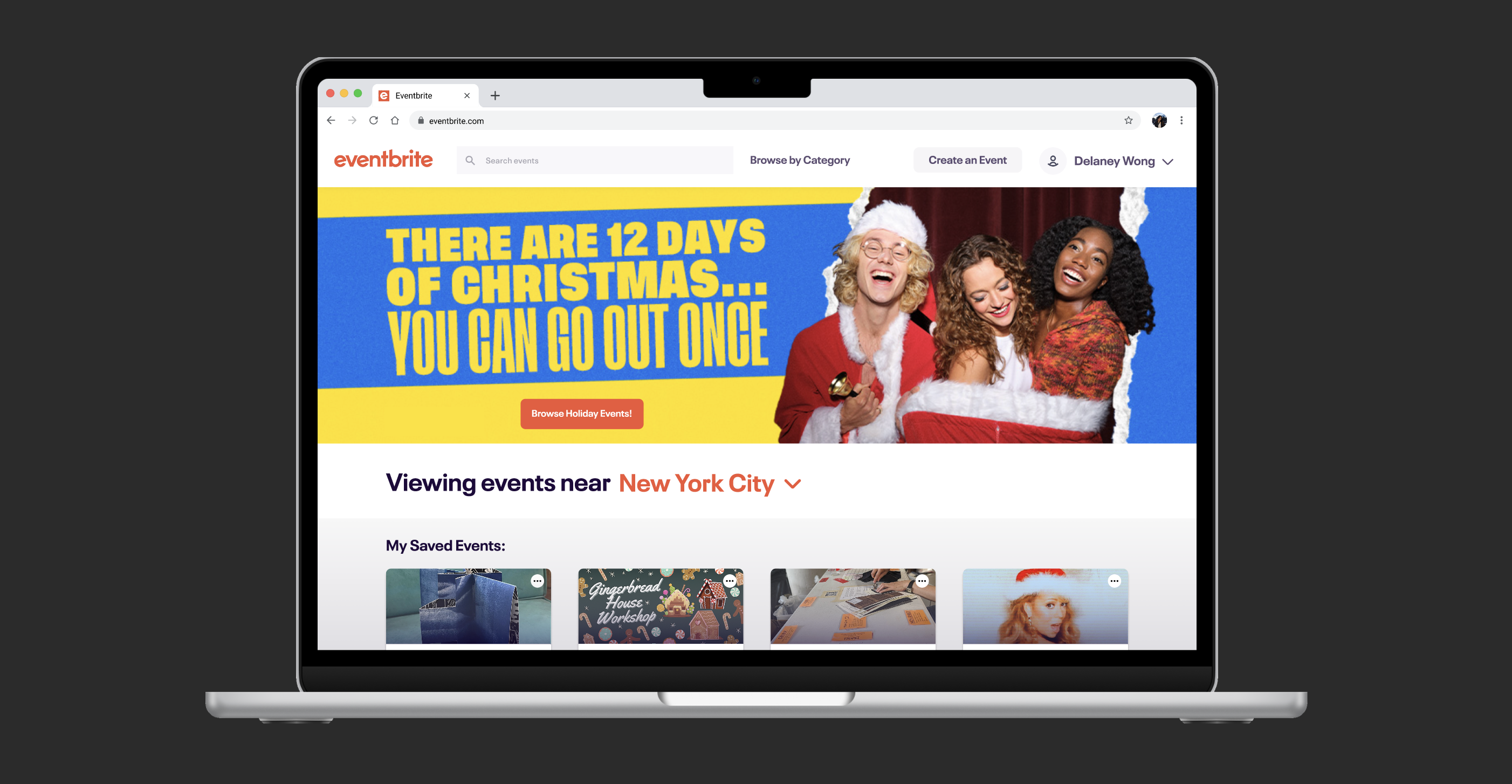
Eventbrite Homepage Redesign
PROJECT OVERVIEW:
As a self-initiated project, we reimagined Eventbrite's homepage to reduce the time and effort required for users to find and engage with events. By making changes to the site’s organization, event cards, and “Organizers to Follow” feature, the goal was a streamlined experience that would allow users to effortlessly navigate and discover events that align with their specific interests.
As a self-initiated project, we reimagined Eventbrite's homepage to reduce the time and effort required for users to find and engage with events. By making changes to the site’s organization, event cards, and “Organizers to Follow” feature, the goal was a streamlined experience that would allow users to effortlessly navigate and discover events that align with their specific interests.
TIMELINE:
November 2023
2 Weeks
ROLE:
Product Designer
November 2023
2 Weeks
ROLE:
Product Designer
TEAM:
Haley Chan
TOOLS:
Figma
Haley Chan
TOOLS:
Figma
Empathizing with Users
After having a conversation in which we identified our own main frustrations with Eventbrite’s homepage, we conducted research on other Eventbrite users to learn more about their experiences, desires, and frustrations with the event-finding service, including what information about events and event organizers play the biggest factors in their decision to learn more about a given event.
Several significant pain points emerged during our conversation and research, with the central issue being that the existing homepage design lacked clarity in presenting crucial information in the event-selection process, hindering users in quickly identifying events of interest.
That led us to our guiding design question:
How can we make Eventbrite's homepage more user-friendly and efficient, ensuring quick access to key event details and enhancing the overall event discovery experience?
Researching Other Platforms
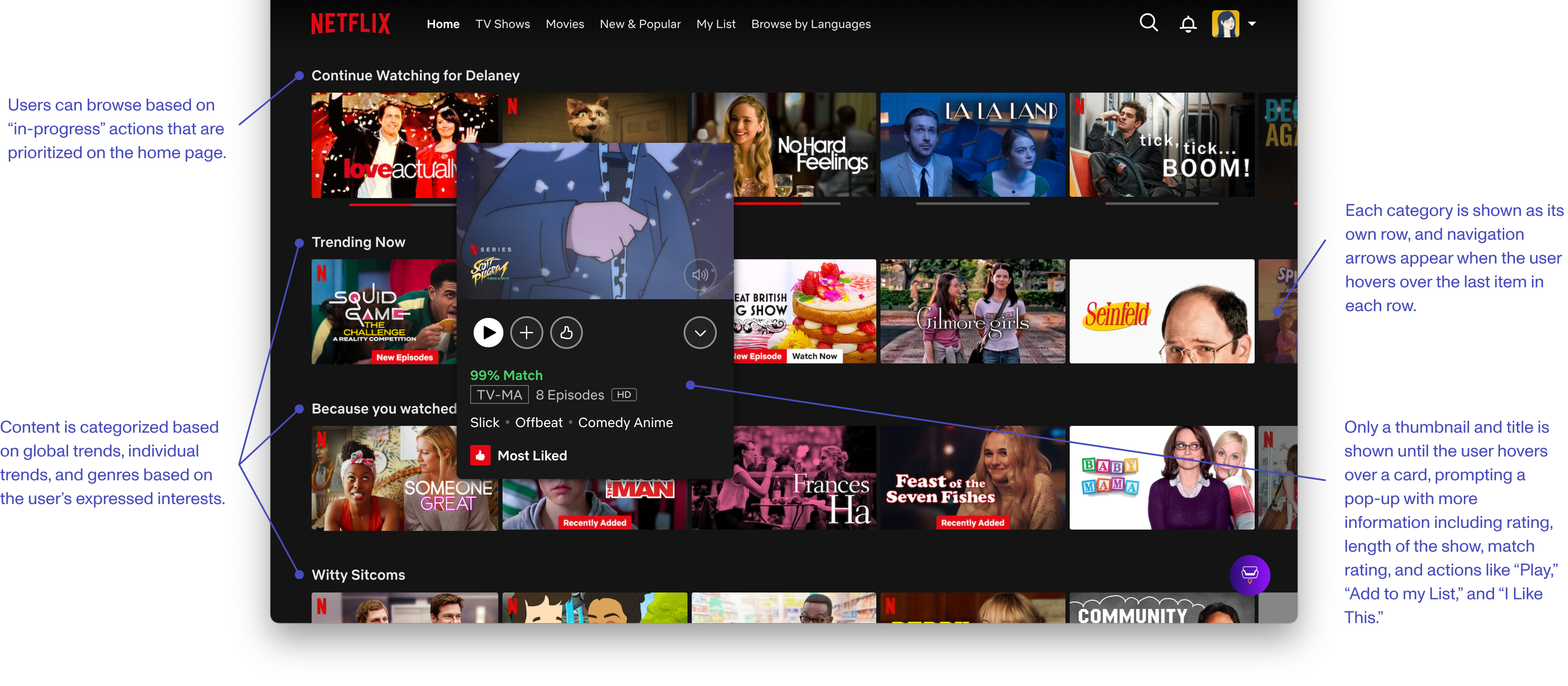
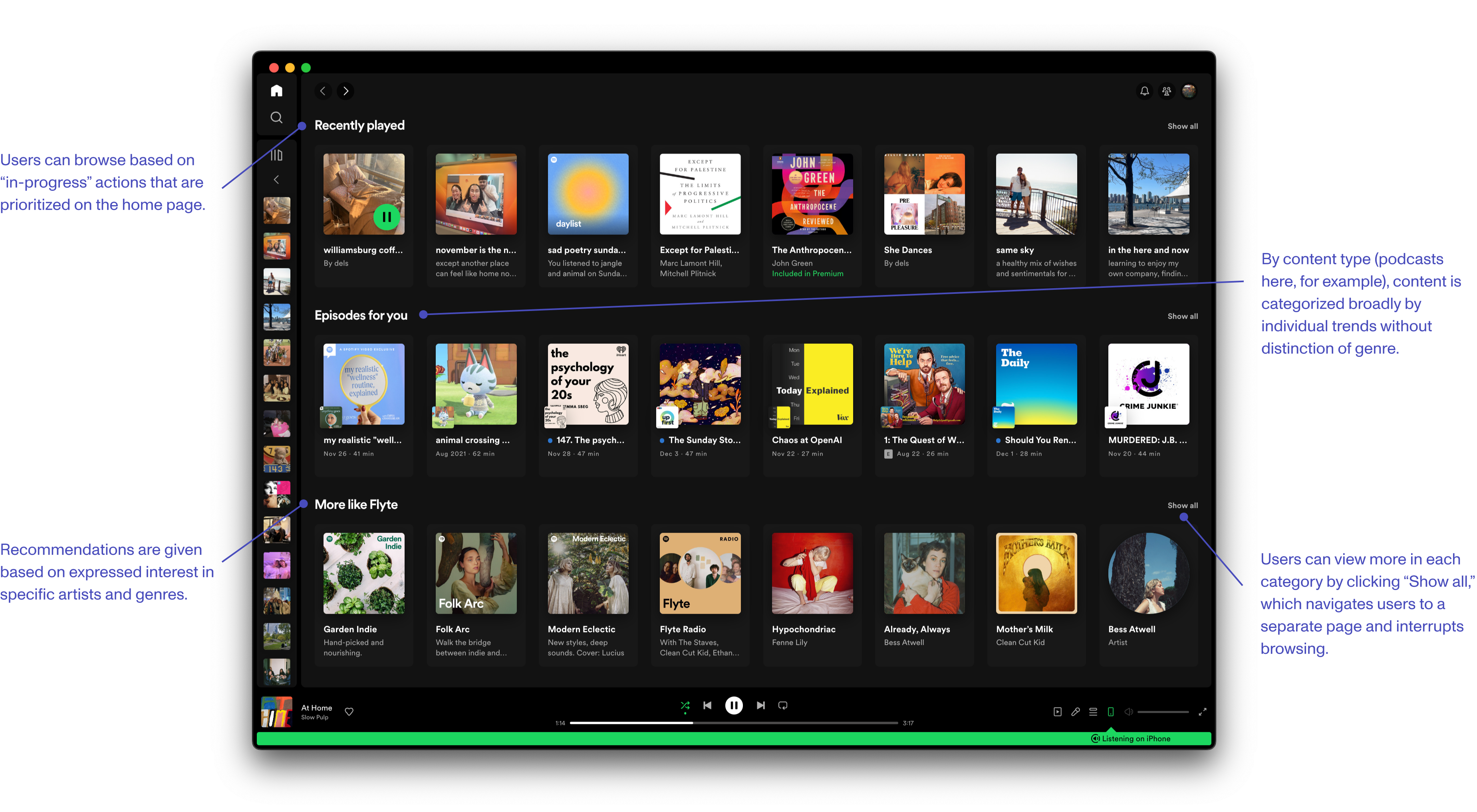
In addition to our user research, we examined the home page interfaces of various leading web services known for algorithm-based recommendations. This comparative analysis aimed to understand how they efficiently organized content categories, helping us strike the delicate balance between providing ample information for users to make informed decisions without overwhelming visual clutter. We chose to look at the interfaces of Netflix and Spotify.
Design Approach / Our Proposed Solutions:
-
Reorganize categories for easier navigation, ensuring algorithm-based labels accurately reflect specific interests.
- Enhance event cards by redesigning them to prioritize key details with intuitive icons, improving overall information hierarchy for quick recognition.
- Revamp the "Organizers to Follow" feature, providing essential information and credibility indicators, such as followers and events, for a more informative selection process.
Design Phase
RELABELING AND REORGANIZING EVENT CATEGORIES:
Original Website Flow:
- From organizers you follow
- Organizers to follow
- Based on your orders
- Based on your views
- Related to your interests
- Organizers to follow
- Based on your orders
The initial design of Eventbrite's homepage presented a challenge in terms of category navigation. Algorithm-based labels, while conceptually useful, proved to be too broad and were not ordered in a way that reflected the priorities of users when selecting events. It seemed as though most of the labels (“Based on your orders,” “Based on your views,” “Related to your interests”) would have presented very similar recommendations with little distinction.
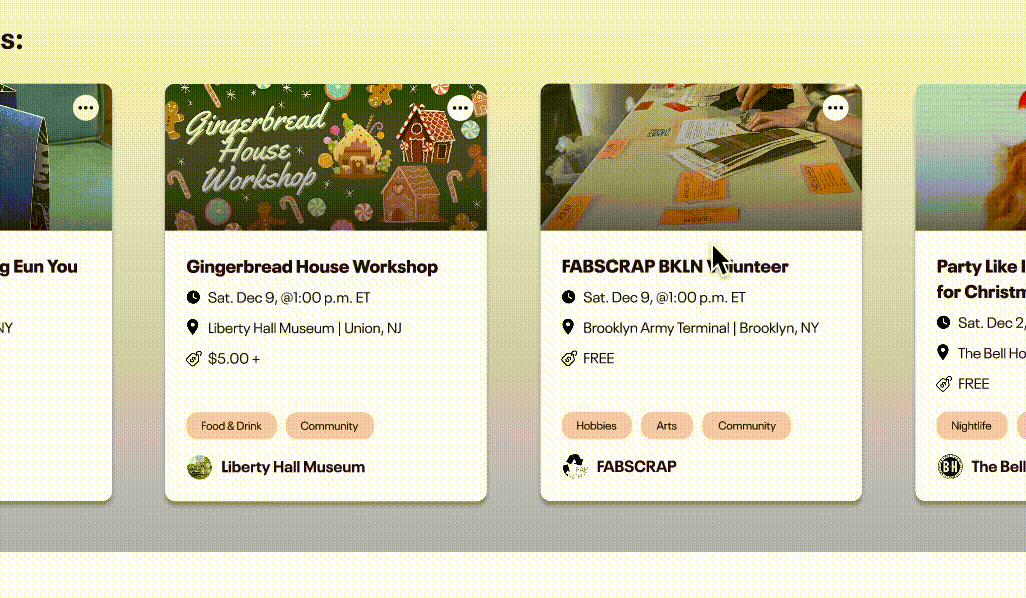
Redesigned Website Flow:
- My saved events
- Top (category) events
- Recently viewed
- Top free events
- Top (category) events
- Organizers to follow
- From organizers you follow
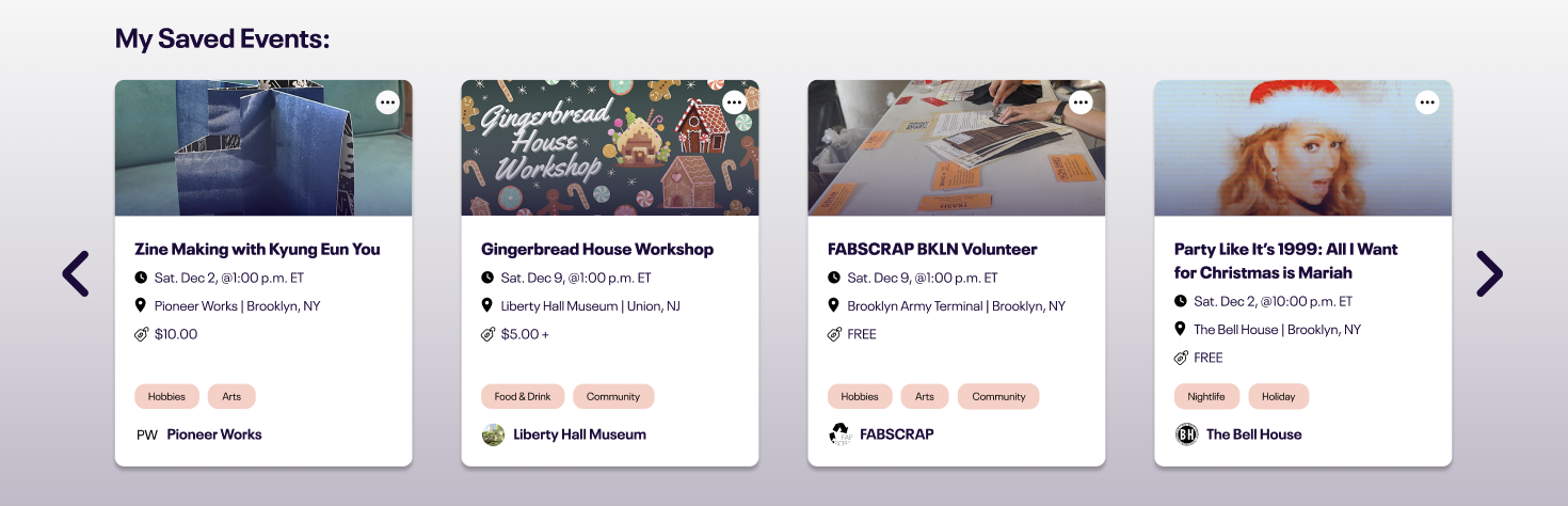
We reduced the scope of the algorithm-based labels to make navigation easier and more intuitive and utilized accent colors to create more distinction between categories. We prioritized “in-progress” actions like saved and recently viewed events by listing them closer to the top of the page.
A closer look at the “My Saved Events” category:
REDESIGNING EVENT CARDS FOR QUICK RECOGNITION:
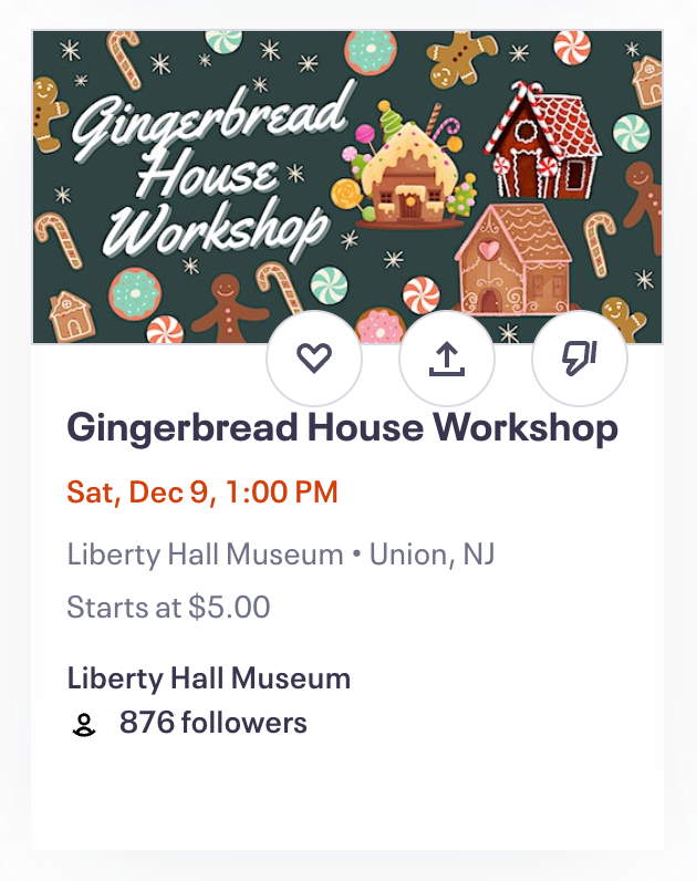
The original design of Eventbrite's event cards posed challenges in quickly conveying key event details. The absence of intuitive icons and a cluttered layout made it difficult for users to efficiently identify crucial information. Additionally, the inclusion of the number of followers on the organizer tag added unnecessary complexity to the card, contributing to an overcrowded visual presentation.
Through our user research, it also became evident that the current symbols– a heart, box with an arrow pointing up, and thumb pointing down– did not automatically register as the save, share, and dislike actions attributed to them for most users, contributing to user confusion and underscoring the need for a redesign.
Original event card design:
![]()
Initial event card redesigns:
![]()

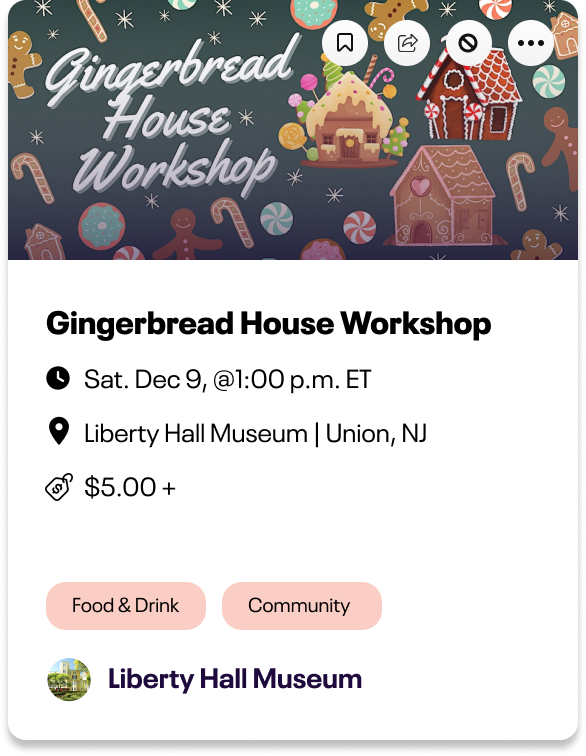
To address these challenges, the redesign of Eventbrite's event cards focused on enhancing information hierarchy and visual clarity. Intuitive icons were introduced to quickly communicate key details such as location, date, and price. Tags were implemented to offer users a rapid understanding of the event's category and alignment to their own interests. We removed the follower count from the organizer tag, streamlining the visual presentation. Icons on action buttons were replaced with more intuitive symbols as revealed by our user testing and were moved behind a '...' button to declutter the card, ensuring a clean and focused user experience.
Final event card redesign:

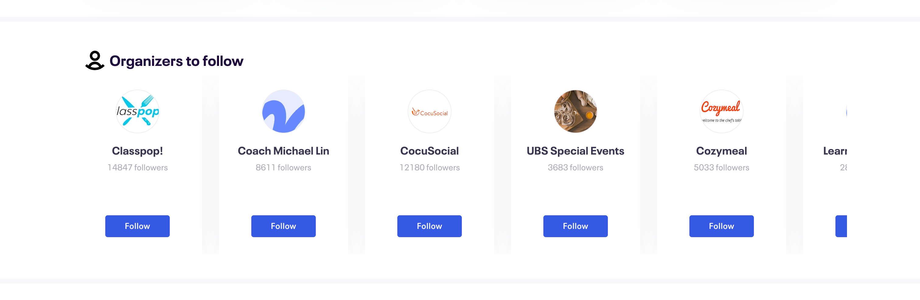
RETHINKING “ORGANIZERS TO FOLLOW” FOR MORE INFORMATIVE SELECTION:
The initial implementation of Eventbrite's "Organizers to Follow" feature lacked depth in providing essential information about the organizer and the types of events to expect from them, resulting in a less informative and engaging experience. The absence of credibility indicators limited users' ability to make informed decisions about which organizers to follow.
Original “Organizers to follow” section:
Initial organizer card redesigns:

Final “Organizers to follow” redesign:

Final Prototype
What’s Next
This project is still in progress! I plan on taking what we’ve done so far to NYU IMA’s Design Lab to get some feedback on my work and learn how I can create a more high-fidelity prototype of different interactions that a user might find on the revamped home page, possibly expanding on what we’ve done so far to complete a full redesign of Eventbrite’s website and product. I’m currently learning about responsive design in my web design class and want to apply those principles to create a mobile-optimized home page as well!
Key Takeaways
Iterative Design and Feedback: Constant iteration and user feedback were pivotal in refining the redesign. This iterative process instilled in me the value of flexibility and adaptability in design. Going forward, I am committed to incorporating iterative design cycles and user feedback loops into all my projects to ensure continuous improvement.
Collaborative Design Thinking: Collaborating with partner on this project reinforced the importance of collective design thinking. I learned that the synergy of diverse perspectives not only enriches the ideation process but also results in more comprehensive and effective design solutions.
Balancing Aesthetics and Functionality: Throughout the redesign, finding the right mix of visual aesthetic and practicality was crucial. I've learned to understand how the visual aspect and the practical side of design work together, which will shape how I approach upcoming projects to make sure they seamlessly combine style and usability.